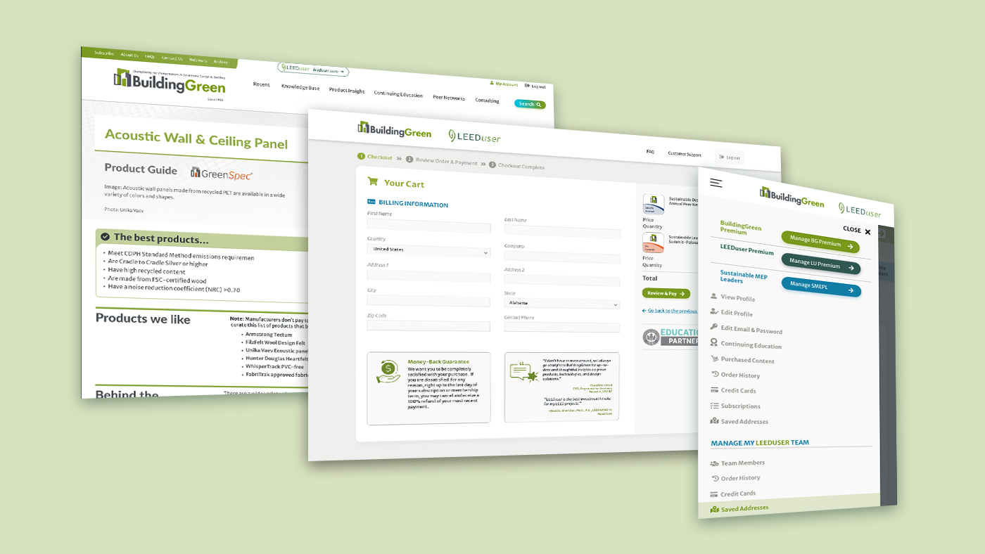
BuildingGreen UI/UX.
Conducting an analysis of competitors with the marketing department was a priority to better understand how the website is placed in the market and who the target users are. Through statistics, it was possible to identify that mobile versus desktop users are about the same percentage. The target users are likely to be subscribers using the website from their desktop computers at work. When reading information outside of the workplace or not necessarily in front of the desk, the mobile version is always handy. Interfacing with the customer support was also an important aspect to evidence areas where the workflow and new features needed improvement. Internal meetings with the team from other departments were a crucial aspect of the research, design, and development of the User Interface of the website. Getting feedback regarding the workflow and design was essential to see things from a different perspective other than the design team. The aspects that were most critical were applying the brand identity to all components and sections, creating a new experience for the user workflow, and creating a mobile-first approach. Regarding more specifically the user interface design, it was fundamental to rethink about colors, style, and icons. The goal of the project was to give a new look to the interface using the new colors and to create a line of continuity for branding.
Some of the critical aspects of the interface:
User Profile
The User Profile is a section used for both the BuildingGreen and LEEDuser website. For this reason, the colors used belong to both palettes, creating a common ground for the two websites which share some of the main brand identity colors. Some of the main issues with the previous user profile were:
- Use of sidebar for navigation and subscriptions management. On the mobile version, the sidebar disappeared and a button “account options” was displayed to access the sidebar where the navigation was represented as a simple list.
- Use of large tables such as the “Order History” were managed with a horizontal scroll for mobile. There was no differentiation for the header of tables and their alignment.
- Visibility for call to actions such as “Edit”, “Delete”, “Set as Default”, furthermore, no clear distinction of the saved addresses and credit cards currently in use
- Management of tabs on mobile for sections with a lot of content such as tables with multiple columns
- Management of “Team Subscriptions” in the sidebar
- “Team Member” was not evidenced in its section
Through the design process, responsive design has always been considered one of the primary aspects. Taking into examination the first design problem, different solutions have been considered before moving on with a final design. The subscription management section, which is now used to also promote the forum, has been moved to the top to enhance its visibility. On mobile, it is still displayed at the top, minimizing the space available. All the navigation is available on the sidebar, while at smaller screen sizes, a burger menu manages the primary menu. “Manage My Account” is a secondary menu that allows access to the same options of the sidebar in desktop.
Checkout
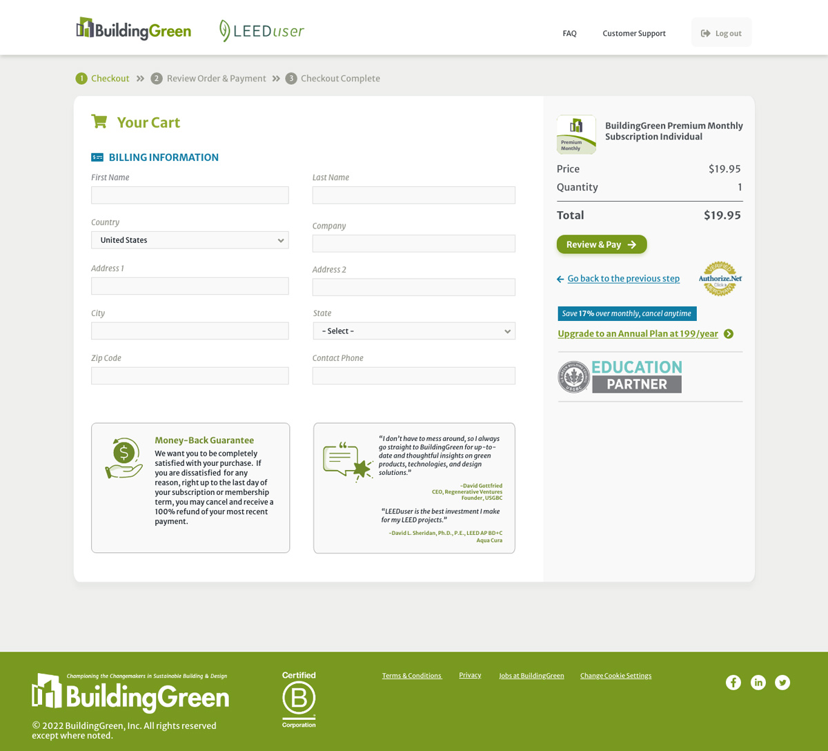
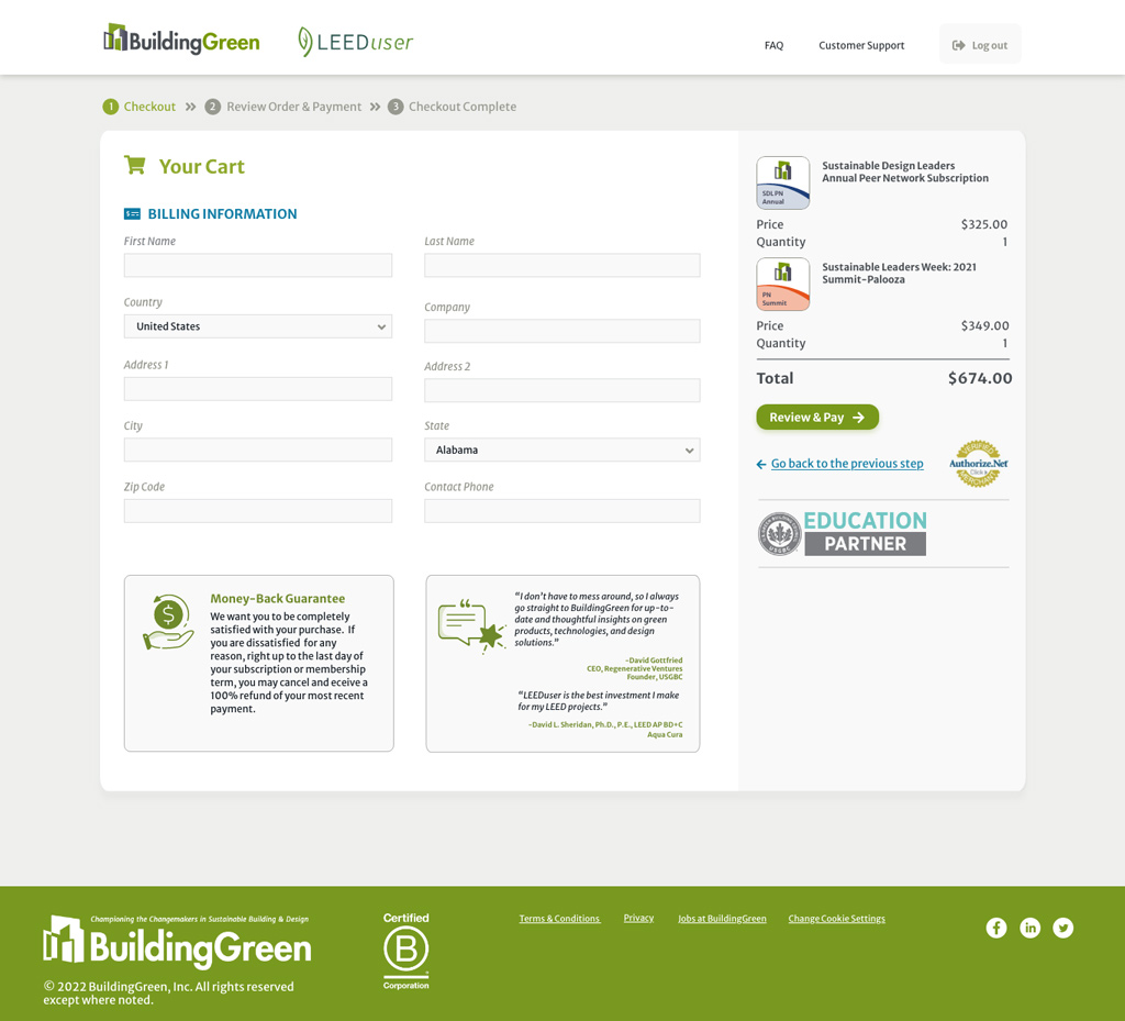
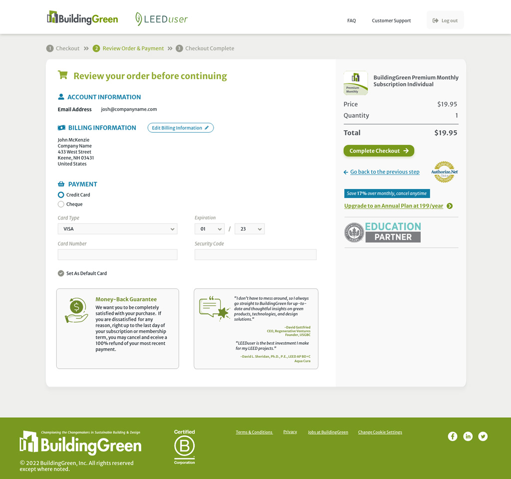
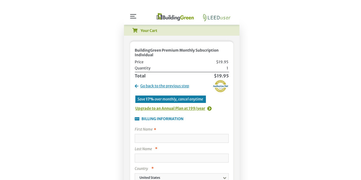
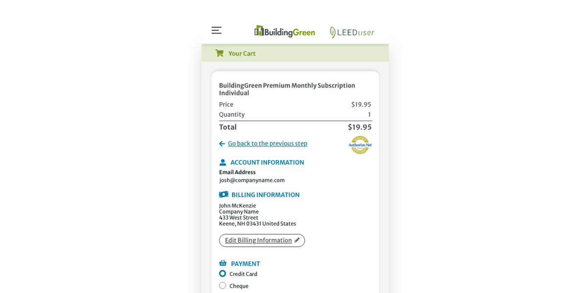
For the Checkout phase, some of the crucial aspects were the “Continue to next step” button placed under the form, the use of space for the form, and the right sidebar used for a disclaimer and quotes. The new design has been approached by thinking about the information the user expects to see first and the workflow to complete the checkout. Titles define the section where you currently are. The subscription price, total, and button to proceed to the next step are at the top of the sidebar. Moreover, during checkout, users can now clearly see the difference in price between the monthly and annual plans in terms of savings. The disclaimer and quotes are displayed below the form which is now divided into two columns to maximize the space. For smaller screens, the call to action is always visible at the bottom to avoid getting lost while scrolling down the form. The disclaimer and quote change color to be more visible while scrolling down.
Article Template
Components that were redesigned:
- Slideshow incorporating both text and images
- Comments available only at the bottom of the page, as well as the “Send by Email” widget
- “Sidebar” widget available in the artcile taking space in the page while reading
- Correlated links to other topics
- Modals for images
- Paywalls with options for monthly and annual subscriptions
- Citations dropdown
- Videos
Each component of the article template has been reconsidered. For instance, the slideshow was opening as a modal with both images and text overlapping vertically. The arrows to the previous and next slide were displayed only as hover status, which made the component not fully usable on mobile. The new component is now divided into two columns. The text is on the left column with a light background that increases readability, while a vertical image is shown to the right. The arrows are on a light background with enough contrast with the image. Clicking on the image still opens a modal with description and credits underneath. In mobile, the same component is composed by the image followed by the text underneath.
Homepage
In the homepage, some of the main issues were the messaging, the arrangement of the recent content, and the use of spaces for the blocks. Taking into examination the “Recent Content”, the news was included with images on the background which often created issues in terms of readability. There was no clear distinction between the featured articles for the month among all the news other than a label. The redesign has been approached by keeping the structure similar to transition to the new website. Users can still similarly navigate the homepage. Only specific reports and feature articles have been highlighted, while other news have a category label in a subtle color to better identify more important items at first glance.
Checkbox Toggle Buttons to Filter Results
Sections such as “Recent” and “Continuing Education” used the sidebar with checkboxes to filter results. These options were available in the right column. On mobile, they were at the top of the page before any results. This aspect made the usability difficult as it required scrolling down and up more times to see the results and change filters. Rethinking about its usability, it was considered where to display filters and what to prioritize in terms of visibility. Using checkbox toggle buttons helped maintain the same functionality and behavior for users by aligning options in the same row, while also saving vertical space to see the first results.
Fixed Menu
Sections with more content and specific subsections, such as “Consulting” and “Knowledge Base”, were using anchors to the content below in the page. Sometimes, it was easy to get lost scrolling down and then coming back to the top. Using a fixed menu at the top was helpful to keep the navigation visible. In the navigation bar, it is possible to switch to another subsection or scroll to the top of the page, while still being aware of using the BuildingGreen website.
