Hannah Grimes.
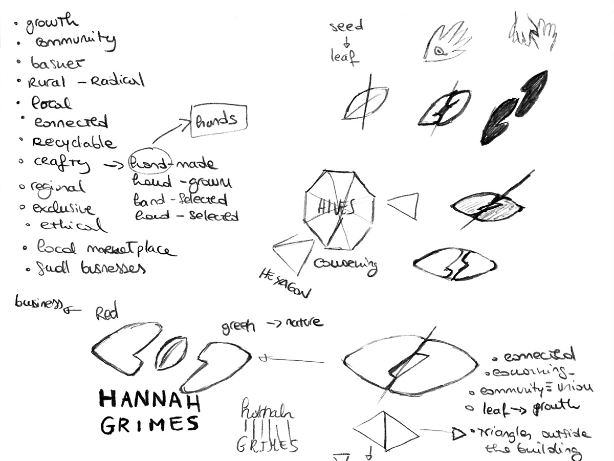
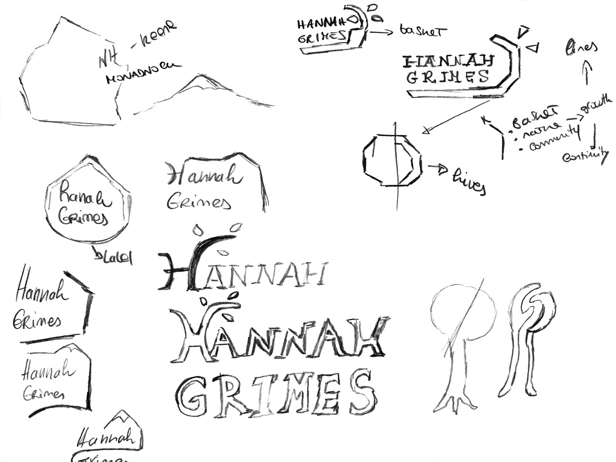
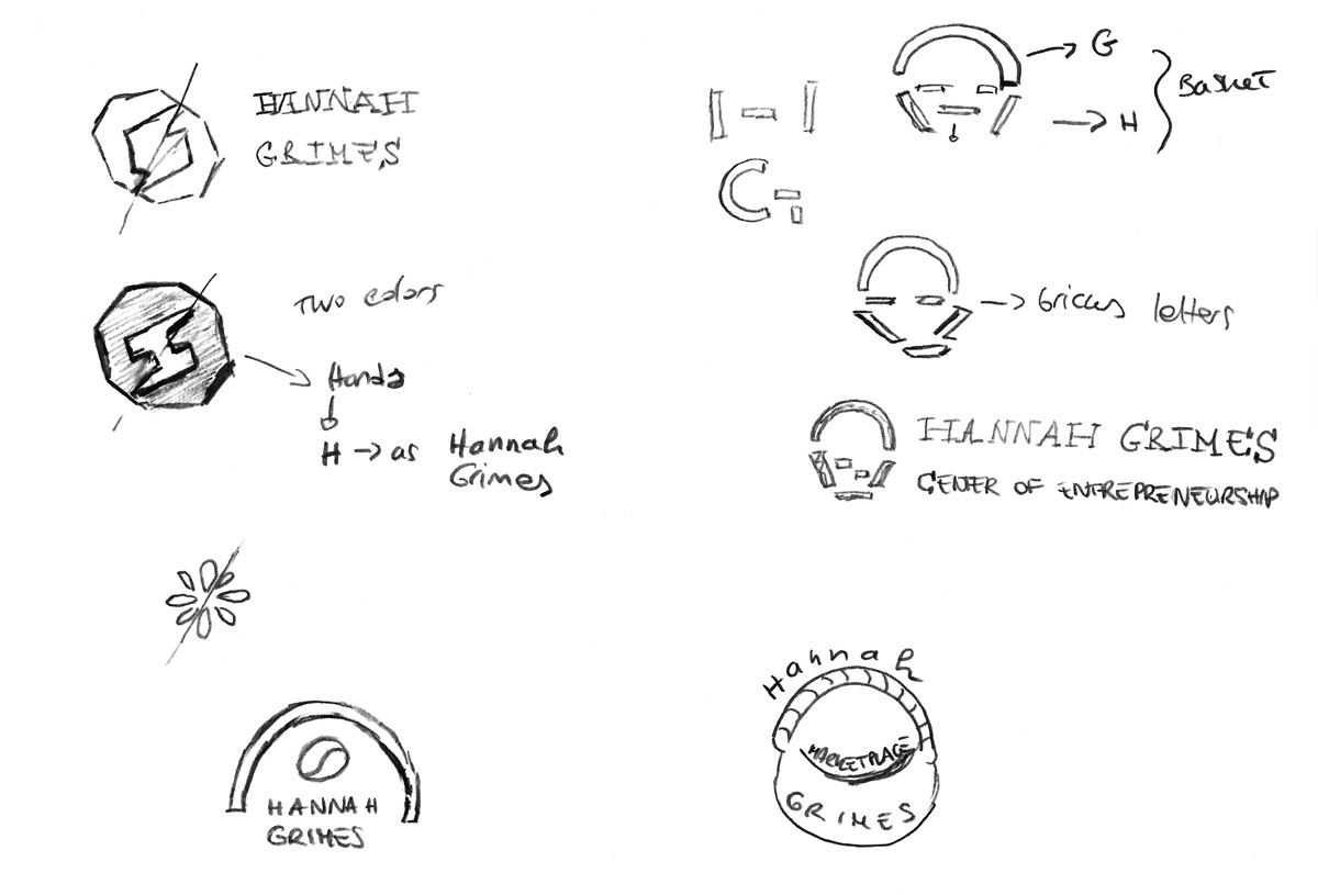
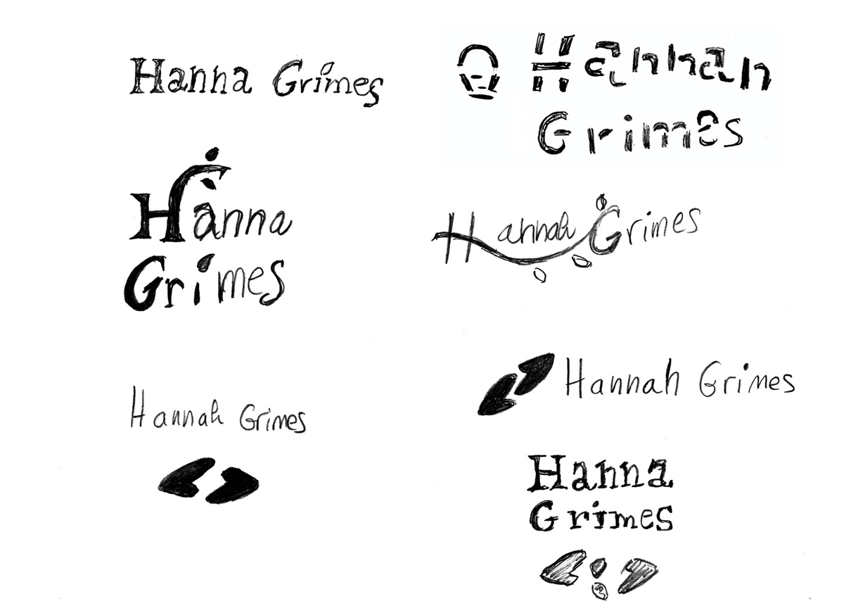
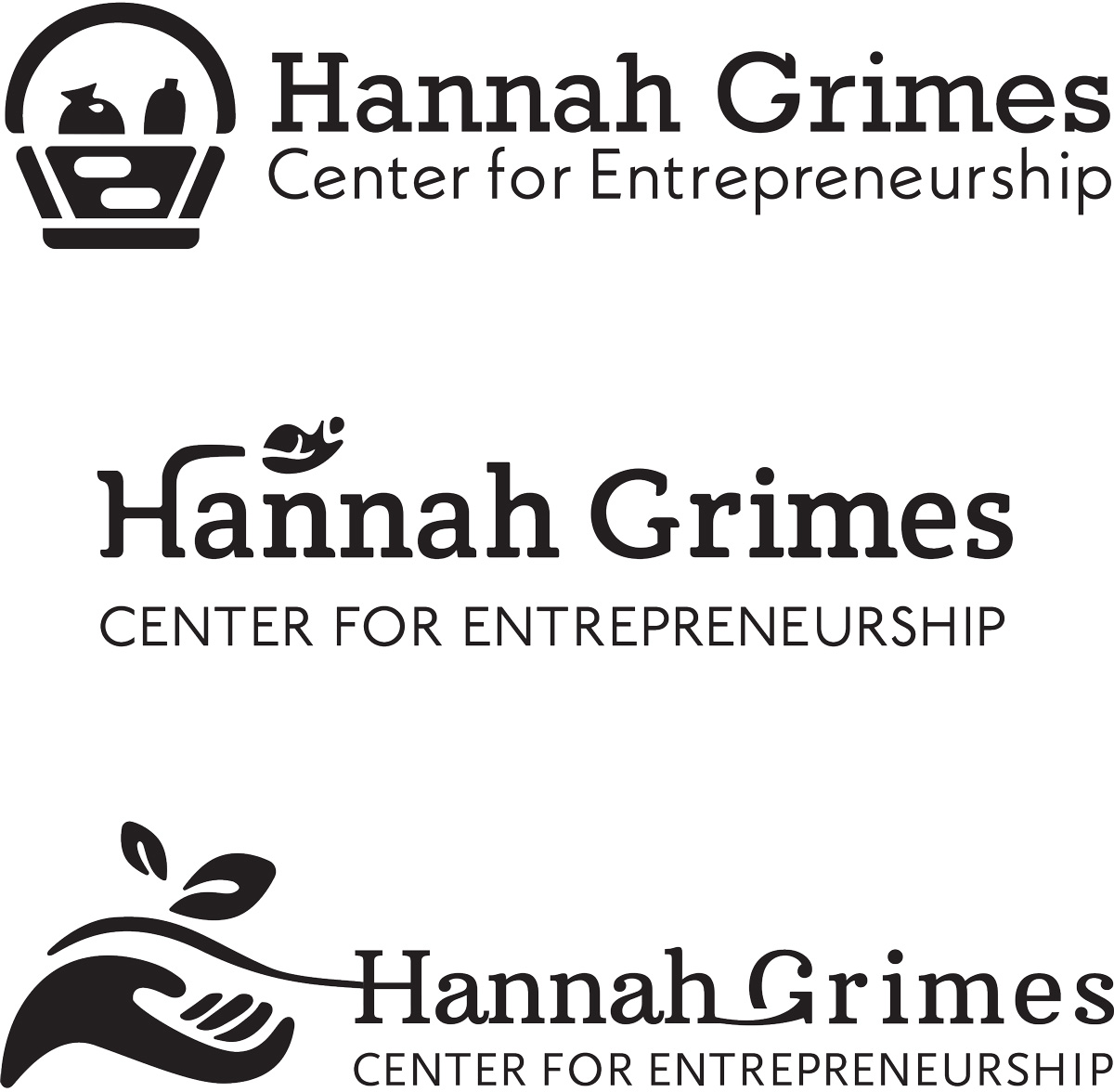
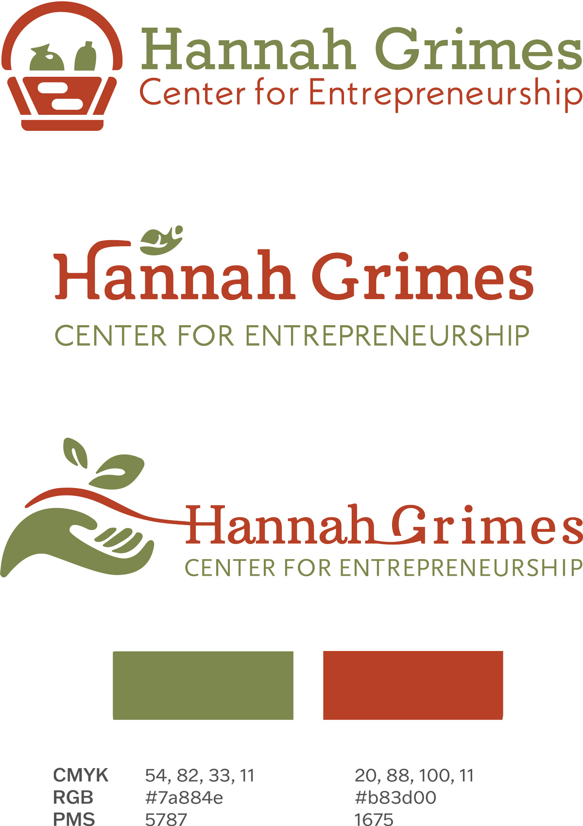
Hannah Grimes includes the center for entrepreneurship and the marketplace. Three different brand identity proposals were created in black and white and two-color version. Each proposal has been designed, starting first with a brainstorming process. From the sketches were selected more interesting ideas and then converted to a digital version in Adobe Illustrator. Each proposal emphasizes its attention on aspects that identify the company, from decomposing letters to recreating the logomark to using shapes and letterforms. More details for each proposal are evidenced here below.
Black Version
Two-color Version
Proposal No. 1
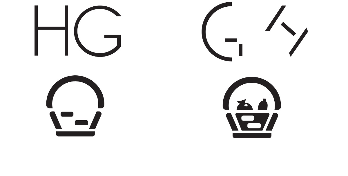
Elements from the original Marketplace logo, such as the basket, blend with abstract lines from the “H” and “G” of Hannah Grimes. The “H” and “G” decompose in pieces reused to create a stylized revision of the basket previously used as the Hannah Grimes Marketplace logo.

Proposal No. 2
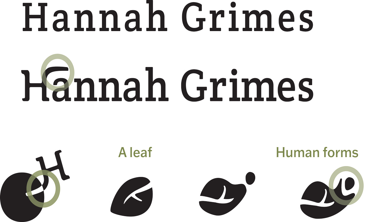
The growth is expressed on the line that extends from the “H”. Natural traits also add to the design blending with human forms that imply the role of the community.
Proposal No. 3
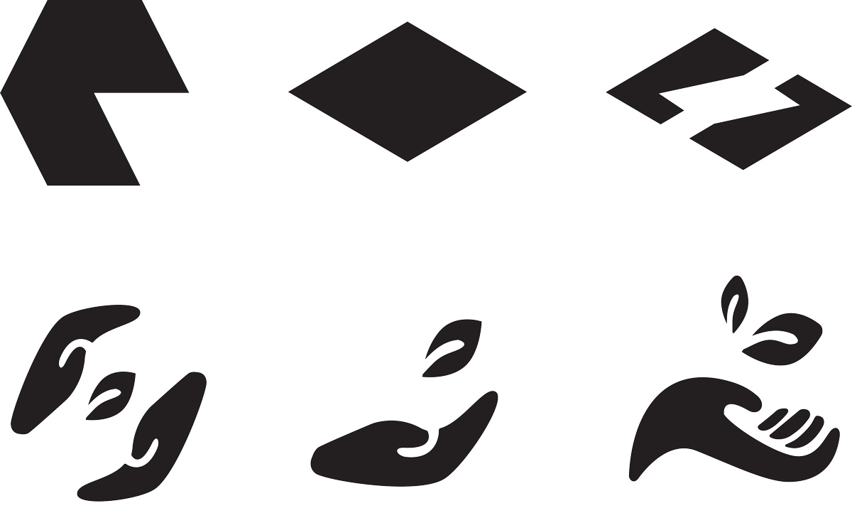
The hexagon decomposes to form triangles. Rounded forms shape the hands underlying the connection with the community. While the leaf evidences the use of natural materials and recycling products.
Sketches
