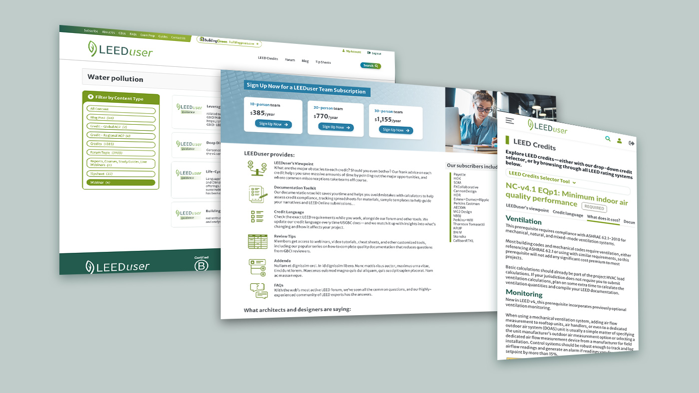
LEEDuser UI/UX.
LEEDuser is a tool for companies who need to create sustainable design projects and find information about LEED credits. The LEED credits selector is one of the main aspects of the website, together with the forum and the related sections. The LEEDuser website has been appositely created with a layout that gives continuity from BuildingGreen. At the same time, LEEDuser maintains his own identity with a specific color palette.
Credits Selection
The credits selector is one of the essential tools for the homepage as well as other pages of the website. In the homepage, this widget was aligned to the left, taking space without highlighting its importance. The first section of the page seemed more focused on emphasizing the introduction to the website. The search bar on mobile was placed below the menu, taking the full width of the page.
The solution to these challenges was maintaining the promotional content at the top while reducing the vertical space used for the selector. The form in the selector was extended horizontally to full width in the desktop version, gaining more visibility when opening the page. The dark colors were replaced with the brand colors to conform the website to the branding style guides. In mobile, the form adapts vertically. In pages with more specific content, such as the LEED Credits page, the form is hidden, allowing the user to make the choice of opening the tool when needed. This solution is conceived to save space and offer users some features as optional.
Forum
The forum in LEEDuser was very similar to the one for Peer Networks Hub. One of the goals was to maintain similar structures between the two websites. In addition to this, while the LEEDuser forum presented more basic features, there were other challenges regarding its structure, such as options to post new questions. Clicking on “Post a Question” opened a modal with a paywall. When logged in, the modal showed option 1 and option 2. Option 1 consisted of the credit selector. After selecting all the parameters, a link was displayed to move forward with the next step. While, for option 2, a list of links to the forums was proposed.
The challenge for the workflow was the use of a modal. The amount of content in the modal was not just a simple message or a button. The modal required completing several actions such as selecting fields, which was hard to accomplish using mobile. While scrolling down, it was easy to click on something else and lose the selection. In the new workflow, when clicking on “Post a Question”, a page opens with both option 1 and option 2 available at Fullscreen. This solution allows the user to focus only on the options available. The credits selector keeps a similar structure to the one on the homepage. Lighter colors are used to pose the two options at the same level of importance.
LEED Credits
The “LEED Credits” section presents a lot of information at the same time. The accordions are displayed into vertical columns depending on the versions available for LEED. Selecting a category opened an infinite amount of content in the column that required scrolling way down the page.
In the new prototype, the page contains all the accordions. When a category is selected, all the information is now arranged in two columns, allowing users to read more easily without scrolling the page down as before.
A second challenge was the subpage for mobile. The tabs were managed vertically, and when a tab was opened, it was not possible to see the next one below. On desktop, tabs were placed on the left column. A more effective approach to responsive design included using the same structure for both mobile and desktop with horizontal scrolling for tabs. In fact, tabs are now aligned at the same level without scrolling down the page. Passing from one tab to the next one is now easier and more intuitive.
