Peer Networks UI/UX.
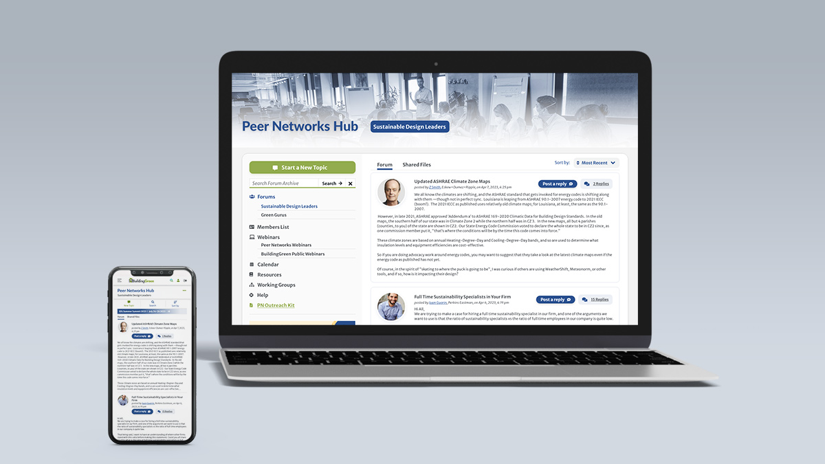
Peer Networks Hub is the forum section available as an add-on to members on BuildingGreen. There are multiple forums accessible to users depending on their membership. Users are Sustainable Leaders who engage with the platform to ask questions, find resources, and participate in events. The old structure was reconsidered to understand how to find solutions that advance the user workflow and usability. The blue color was selected beforehand in the brand guidelines as a secondary color also used for Peer Networks.
New Workflow for Mobile
The header represented one of the main challenges. This included the main navigation for the forum, the search for the website and forum, networks, a second layer of navigation managed through tabs, the call to action “post a message”, and the title of the forum. The goal was to focus on the most important features for users while considering workflow and usability for responsive design. In smaller screens, the three key main areas users needed were identified: post a message, the search bar, and the sort by. These areas were converted into a navigation bar. When clicking on the search bar, a search field opens to complete the search within the archive, allowing users to close it. Similar to desktop, “sort by” opens a dropdown menu to select either Most Replies or Most Recent. Right below this section, a promotional banner replaces the visual asset that was displayed in the sidebar for desktop. All the navigation is included in the More Options menu (Meatball menu) in the same hierarchy recreated for desktop. The call to action “Start a New Topic” is available to users here as well. Functionalities of the main website are instead managed at the top of the website with a burger menu including the main menu, search, login, and logout (if logged in). The name of the section is outlined directly below the name of the main section of the website. When scrolling down the page, the name of the section and More Options menu become a fixed element the user can use at any time.
The Navigation
Considering the navigation for desktop as well, an interesting aspect was that all the forums and sections were displayed at the same level with no differentiation. For users who belonged to multiple networks, all the forums were displayed next to navigation items such as “Webinars”, “Calendar”, “Resources”, creating confusion in terms of hierarchy. Moreover, the names of the forums composed of multiple words were taking up more space than was available. They also were overflowing underneath, creating a second row.
One of the solutions adopted to solve this problem was to use the sidebar already available to the left to incorporate the navigation which is now divided into categories. As a result, in the sidebar under “Forums”, users can find the forums available depending on their membership. Items in blue in the navigation highlight the current section in use. All the sections are listed based on their hierarchy. The call to action “Start a New Topic” and the search bar are still located in the sidebar which hosts promotional digital assets as well. The second level of navigation composed by “Forum” and “Shared Files” available for the forum section is still using tabs like for the section “Resources”. The tabs located at the top of the section are context based, which means that depending on the section selected, they may change name and content. They are helpful to support the main navigation and even from mobile can still be easily managed. Some sections do not make use of this second level of navigation, which means that in those pages, there are no tabs.
Sort By and Tables
Another area for improvement is the main section of the forum composed of a table with “Topic”, “Replies”, and “Recent”. When opening the forum, the most recent posts were displayed under “Topic”. When clicking on “Replies”, the list of posts was sorted by the most popular ones. While clicking on “Recent”, the posts were again sorted by the most recent posts. On mobile, the two columns to manage the sort by disappeared, giving no options to users.
The solution to this challenge came by removing the table and including the posts in the main section as consecutive items. A dropdown aligned at the top right now displays the options for the sort by, Most Recent or Most Replies. This solution is then adapted in mobile by keeping the dropdown. When using either a mobile or desktop device, users can now make decisions independent of the device used.
Multiple Filters and Other Sections
Sections with more filters at the same time, such as “Members List”, were particularly more difficult to use with mobile screens. The filters by network and region were both managed with lists of multiple radio buttons. These lists took space from the screen, making the usability for this section awkward.
The approach adopted was to replace the radio buttons with checkbox toggle buttons already used throughout the website. All the options are now aligned in a row taking less space. Moreover, for mobile, this section presents the “Filter by” and “Sort by” options. The dropdown is visible when clicking on “Filter by”, allowing users to open this optional menu only when needed.
More previews of other sections are also included in the video below.
